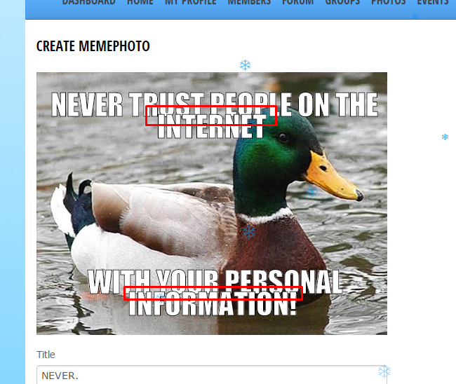
And the spacing between the text lines looks weird. Either it's to far away. Or it's to close to each other:

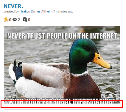
And at last there's the preview page. This type of cropping looks extremely ugly:
I'm giving you a chance to patch this (Not just sending me the fixed version like you've done with the other posts reporting these type or problems) before i leave a review. Because currently... This plugin is not worth 25$!

