We build. You grow.
Get best community software hereStart a social network, a fan-site, an education project with oxwall - free opensource community software
very nice but there is no the third column - white | Forum
I personally think it should be wider and brought this to your attention already.
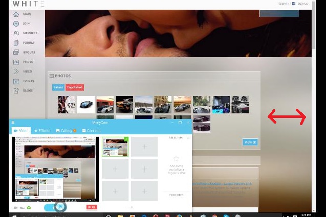
When the header image is wider then the profile header it looks ridiculous.
also the user hint window is transparent making the contents hard to read.
how can the one header be wider than another, they have the same width? please show it on the screenshot
default tips or the hint plugin functionality?
as it is stated in my tor, I do not guarantee compatibility with 3rd party items.
You need to add this style either to Edit CSS section of the admin panel or to the base.css file of the theme
.hint-content{
background-color: YOUR VALUE!important;
}
This is the single most popular free plugin in the oxwall store. Surely you can update the theme file and release an update for such a large audience.
Heres another idea. When a user brings an issue to your attention update the css file of the theme and release an update to avoid other users having an issue. Thats what the other theme developers have always done for me and for a lot of other users. If you are going to be labeled a TEAM member then I would expect to see you go one step further then the other users and sellers here not one step behind.

