We build. You grow.
Get best community software hereStart a social network, a fan-site, an education project with oxwall - free opensource community software
Support - SimplyResponsive | Forum
Darryl B
Sep 8 '16
Post your support questions here. These should only be related to the
theme. I don't have any control over the core, or third party plugins. I
have added some special css for a few plugins, but I don't have all of
them. Devs should really take responsive considerations into their
plugin design.
Darryl B
Sep 10 '16
Here is a guide to changing, or adding icons to the main menu. The
puzzle piece is a default icon used when the menu item isn't already
defined in the css. This is a guide for the main menu only. All of the
other icons, including the ones in the sidebar are called by the system,
or directly from plugins, and are used site wide.
Darryl B
Sep 10 '16
Here is some info about responsive themes vs.plugins. Although the theme
has responsive ability, and has taken the base Oxwall plugins into
account; third party plugins vary in responsive design. Some will only
view well down to a tablet size, and others have absolutely no mobile
capability at all. It is primarily up to the plugin dev to take mobile
capability into account when they design the plugin. Theme dev's hands
are tied since there is no way to know what a plugin can and can't do. I
use a range of @media queries in the four themes to enhance mobile
view. I will list them here. Maybe it will help if a dev sees them.
@media only screen and (min-device-width : 320px) and (max-device-width : 480px){
}
@media only screen and (min-device-width : 320px) and (max-device-width : 480px) and (orientation: landscape) {
}
@media only screen and (min-device-width : 481px) and (max-device-width : 767px) {
}
@media only screen and (min-device-width : 481px) and (max-device-width : 767px) and (orientation: landscape) {
}
@media only screen and (min-device-width : 768px) and (max-device-width : 1024px) {
}
@media only screen and (min-device-width : 768px) and (max-device-width : 1024px) and (orientation: landscape) {
}
@media only screen and (min-width: 1025px) {
}
The Forum post is edited by Darryl B Oct 8 '16
Darryl B
Sep 13 '16
The theme is designed using ltr "left to right" text direction. I have
looked, and there seems to be no easy solution for rtl "right to left"
text direction short of changing several css elements. I did find this
below. What it would do is put everything in an rtl direction to a ltr
direction allowing all of the css to display correctly while keeping the
rtl language. Maybe someone with an rtl language direction can let me
know if this is a sufficient fix for the issue, if so I can add it to
the theme css, if not I won't.
Add this to the custom css for the theme in the admin panel.
body, html {
direction: ltr;
}
Here's an interesting find for rtl conversion. I don't know how well it works.
https://www.google.com/...e=utf-8&oe=utf-8
Add this to the custom css for the theme in the admin panel.
body, html {
direction: ltr;
}
Here's an interesting find for rtl conversion. I don't know how well it works.
https://www.google.com/...e=utf-8&oe=utf-8
The Forum post is edited by Darryl B Sep 13 '16
Darryl B
Sep 27 '16
**This was added to the theme css on build 9900**
I noticed that with the advertisement plugin that large banners placed in the content section carry off the page on mobile screen widths. I've found this simple fix for it. Just add it to your custom css in the admin panel for the theme, and the banners will size to fit the screen width. I will submit this to the dev, if he doesn't implement it in the plugin, I will add it on an update. I would prefer that the devs make there plugins mobile friendly. You can copy, and paste all of the css below including the comment. That way you'll know what it is for.
/*Advertisement banner fix*/
.ow_ads_cont img {
max-width: 100%;
height: auto;
}
Edit: The dev will not add this to the plugin. It works with banners that I have on my test site. I will add it to the theme as an update.
The Forum post is edited by Darryl B Oct 7 '16
Darryl B
Oct 20 '16
**Added this fix to the latest update** 9970
Found a fix for the "Friend Lists" plugin. Currently the drop down on smaller screens is positioned above the "Moderation" and "More" buttons when you have the "Profile Cover" plugin. When you expand the Friend Lists drop down it i difficult to navigate the drop down menu because the "Moderation",and "More" buttons interfere. This simple css that you can add to your custom css in the admin panel will set the z-index of the Friend Lists drop down at a higher z-index position allowing the drop down menu to appear over the "Moderation", and "More" buttons so the menu can be easily navigated. I have seen this same thing with other themes, but I'm giving you a fix here, and again, I am waiting to see if the dev may add this simple fix tot the plugin before adding it to my themes. If I do end up adding it, I will post it in the update section so you can remove it from your custom css before updating.
.fl-context-w.fl-context-checked {
position: relative;
z-index: 10;
}
The Forum post is edited by Darryl B Nov 14 '16
Bruce Tran
Jun 7 '17
Hi Darryl,
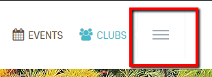
Do you know how to prevent the "additional menu marker" from showing up on the main navigation? I don't see that from the original Simplicity theme until it's not enough space to show all the menus. I'm using your SimplyResponsive theme.

Do you know how to prevent the "additional menu marker" from showing up on the main navigation? I don't see that from the original Simplicity theme until it's not enough space to show all the menus. I'm using your SimplyResponsive theme.

The Forum post is edited by Bruce Tran Jun 7 '17
Darryl B
Jun 7 '17
Helo Bruce. I am away from home this week. I will have a look when I get home. It will probably be a matter of adjusting the font size of the menu item, or icon, or possibly the padding between them. Apparently there is only so much space in the menu before the more icon displays.
Some menu items have longer names, and may still trigger it, if they are positioned to display in the first few.
The Forum post is edited by Darryl B Jun 7 '17
Darryl B
Jun 10 '17
@Bruce Tran
I think I have found the solution. Add the following to your custom css for the theme in the admin panel. I have tested it out, and it appears to be working. There is apparently something in the js for the menu that will display the "Menu More" when it is needed. I found it by double checking against the Simplicity theme. I will test some more before adding it as an update.
.ow_menu_more_wrap {
display: none;
}
The Forum post is edited by Darryl B Jun 10 '17
Darryl B
Jun 12 '17
Great. Thanks for finding it, and helping to test it. I will add it on the next update of the themes.
Note: Fix was added to recent update. If you have applied this to the custom css section in the admin panel, you can remove it before updating.
Note: Fix was added to recent update. If you have applied this to the custom css section in the admin panel, you can remove it before updating.
The Forum post is edited by Darryl B Jun 22 '17
Darryl B
Feb 12 '18
Font Awesome integration is version 4.7.0. If you are adding your own
icons, you will need to use the icons at the following link. Currently
I'm not very impressed with the free version of Font Awesome 5. the new
free version requires a font weight of 900 which is a bold setting. This
affects the appearance of some of the icons. I will continue to check
in to see if they improve this. The free version of Font Awesome 5 is
also the only one that can be used in distribution.
https://fontawesome.com/v4.7.0/icons/
https://fontawesome.com/v4.7.0/icons/
This topic is sticky
You do not have permission to reply this topic
