Is there a CSS code i can put i my custom CSS box to make the profile picture not show only on Mobile phones ?
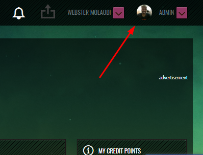
I want it to show o Desktop and Tablet but not on Smartphones.
Is there a CSS code i can put i my custom CSS box to make the profile picture not show only on Mobile phones ?
I want it to show o Desktop and Tablet but not on Smartphones.
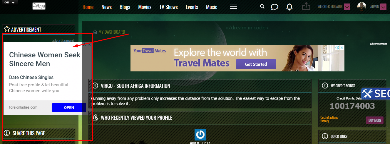
With the above fix inserted the side -bar fix no longer works now it shows like this :
footer .container {
padding-right: 0;
padding-left: 0;
}
.ow_footer_menu {
text-align: center !important;
}
.datagrid table tr {
display: flex;
justify-content: space-between;
}
.datagrid table tbody td {
display: flex;
justify-content: center;
}
only screen and (max-width: 768px) and (min-width: 320px) {
.datagrid table tr {
display: block;
}
.datagrid table tbody td {
text-align: center;
}
}
footer .ow_footer_menu {
font-size: 11px;
padding: 50px;
width: 100%;
text-align: left;
text-transform: uppercase;
font-size: 13px;
font-weight: normal;
font-family: 'Oswald', sans-serif;
border-bottom: 1px solid rgba(0, 0, 0, 0.08);
margin-bottom: 10px;
background: rgba(0, 0, 0, 0.84) url(images/stripe.png);
}
.ow_anno {
background: rgba(0, 0, 0, 0.78);
border: 1px solid rgba(0, 0, 0, 0.39);
padding:10px;
border-radius: 4px;
-moz-border-radius: 4px;
-webkit-border-radius: 4px;
}
html body.gravcitylights .ow_console .ow_sitesearch_console_dropdown, html body.gravcitylights .ow_console .ow_sitesearch_console_dropdown:hover{
}
html body.gravcitylights .ow_console .ow_console_item a.ow_sitesearch_icon{
margin-top: 16px;
}
.fl-context-w.fl-context-checked {
position: relative;
z-index: 10;
}
(min-width: 1100px) {
.ow_sidebar {width: 25%;}
.ow_canvas {max-width: 74%;}
.ow_side_box {width: 25%;}
.ow_footer {max-width: 73%;}
.base_user_join .ow_side_box {display: none}
.base_user_join .ow_canvas {max-width: 100%;}
}
.responsive-image {
width: 950px;//Any width you want to set the image to.
max-width: 100%;
height: auto;
}
(max-width: 480px) {
.console_avatar{
display: none !important;
}
}
Nevermind, i got it fixed...somehow Oxwall was stripping out @media on the CSS hence some codes didn't work.....Thanks for your help.