We build. You grow.

Get best community software here

Start a social network, a fan-site, an education project with oxwall - free opensource community software

Crayon theme responsive? | Forum

Topic location: Forum home » Support » General Questions
Blukkie
Blukkie Feb 21 '13
I'm a fan of the Crayon theme. The only problem is that its not responsive.

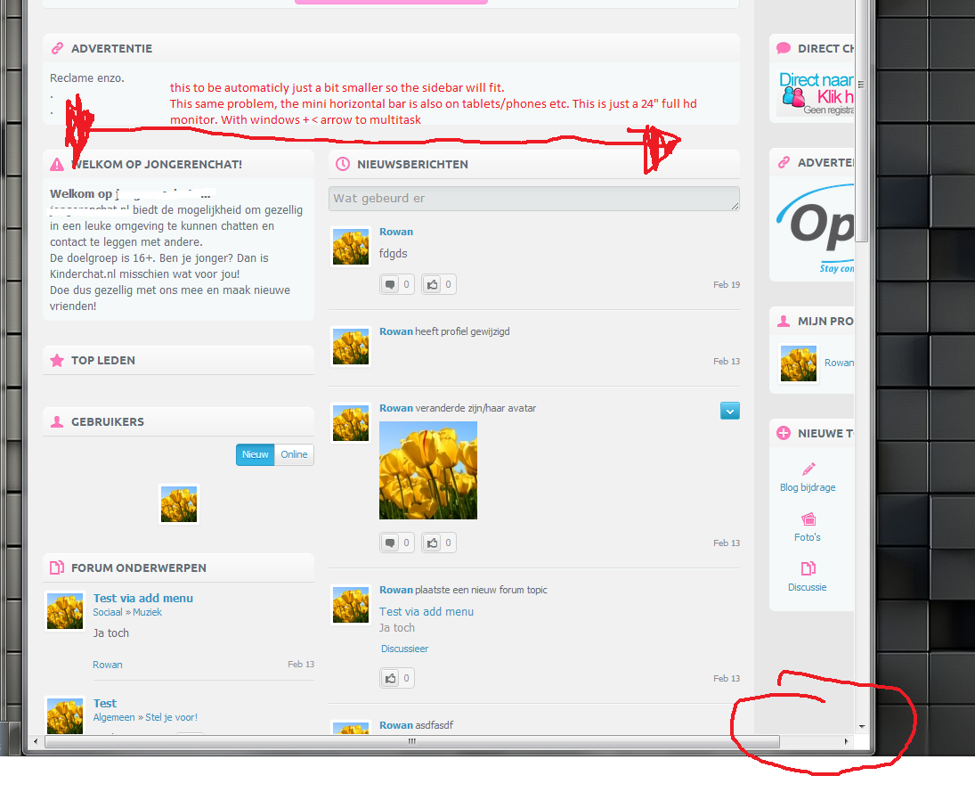
When you make your browser (even a bit) smaller, you directly get the horizontal scrollbar. 


This scrollbar is directly visable on mobile/tablets or small monitors. Just a bit annoying and not necessary.


Can someone explain for a noob like me how I can make this Crayon theme a bit more responsive?


Thanks!


The Forum post is edited by Blukkie Feb 21 '13
Alia Team
Alia Feb 25 '13
Blukkie, not sure what you mean.

Here is how small my browser window needs to be (full size winow is behind) for the horizontal bar to appear:


>>Just a bit annoying and not necessary.

No matter how I tried, but horizontal bar appeared just when it had to appear ( so that I can scroll to see the whole website).

Blukkie
Blukkie Feb 25 '13
Thanks alot for the answer, Aliia!


On my mac I dont have the problem neither. But on windows (17" 19", 22" 24"FHD and Ipad/galaxy tab 2 + phones you get the little horizontal bar. 

I've attached a screenshot. This screenshot is made on 24" full hd resolution. Windows 7, chrome. (but also in IE)

When I do windows + arrow key to split up the screen you see this. On ipad for example you always see this.

So maybe you get what I mean now. Sorry for the bad English!

Attachments:
  Naamloos.png (299.97Kb)
Alia Team
Alia Mar 1 '13
Oxwall themes are designed to work  on screens with 1024X768px resolution in full size browser windows without zooming.

Currently Oxwall doesn't support any mobile devices. But we try to make sure that most of the major features work there.

You have mentioned that you can see this problem on regular computers ( windows) with small screens. What resolution do those screens have?