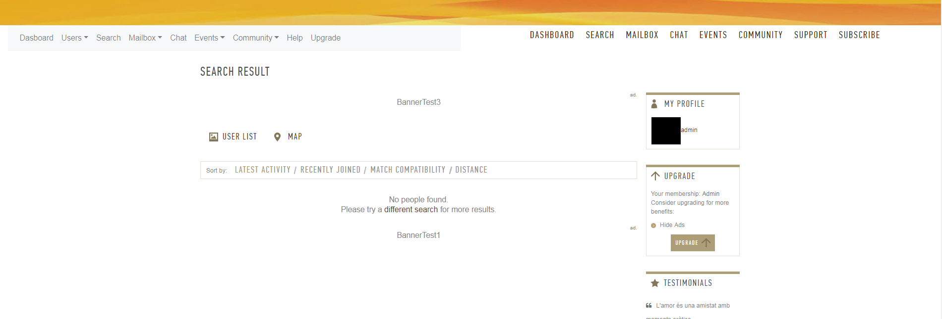
1. The <UL> that forms the menu has the classes "navbar-nav mr-auto" but if you added the class "ow_main_menu" it would inherit the style (font/color) of the current theme, even if it's not the Oxwall default. I've tried it with the PlatinumPro and it merged with the theme a lot better.
2. Now, the whole menu row is left-aligned, some themes have the content centered-aligned (leaving space at left and right), having an option in the settings page to choose the menu alignment: () left, () center, it would be great.
3. There is a small glitch in the css when view from the mobile: the right arrow that marks the dropdown options has been wrapped to the next line, obviously should be kept to the right of the text (see screenshot).
That's all, it looks promising!
-------
Updated: Not sure about the background color setting, I enter an hex RGB value (#FF0000), a red box is shown to the right of the input text, but no red color is shown in the front-end menu. (?)


