Hello,
How can i hide widgets for mobile version?
Thanks in advance.
here is a code example:
$placeWidget = $widgetService->addWidgetToPlace($widget, BOL_MobileWidgetService::PLACE_MOBILE_INDEX);
uncomment or delete the line that place the widget in mobile version should working
not forget inactivate and then activate the plugin after changes
Hello Skadate Sweden,
I tried, but it also disappears from the mobile version and the desktop version.
I want only Main page.
Hello Marcus , i have a theme , not work panel.
 Leader
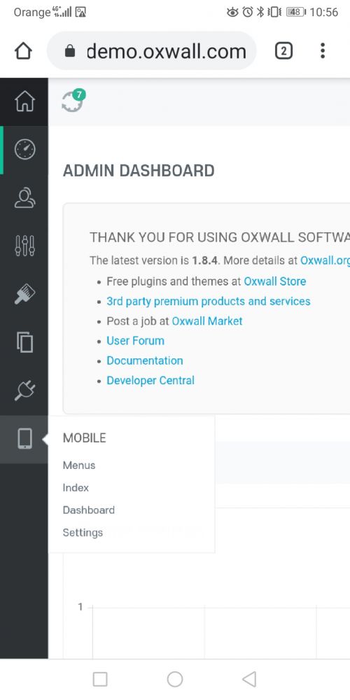
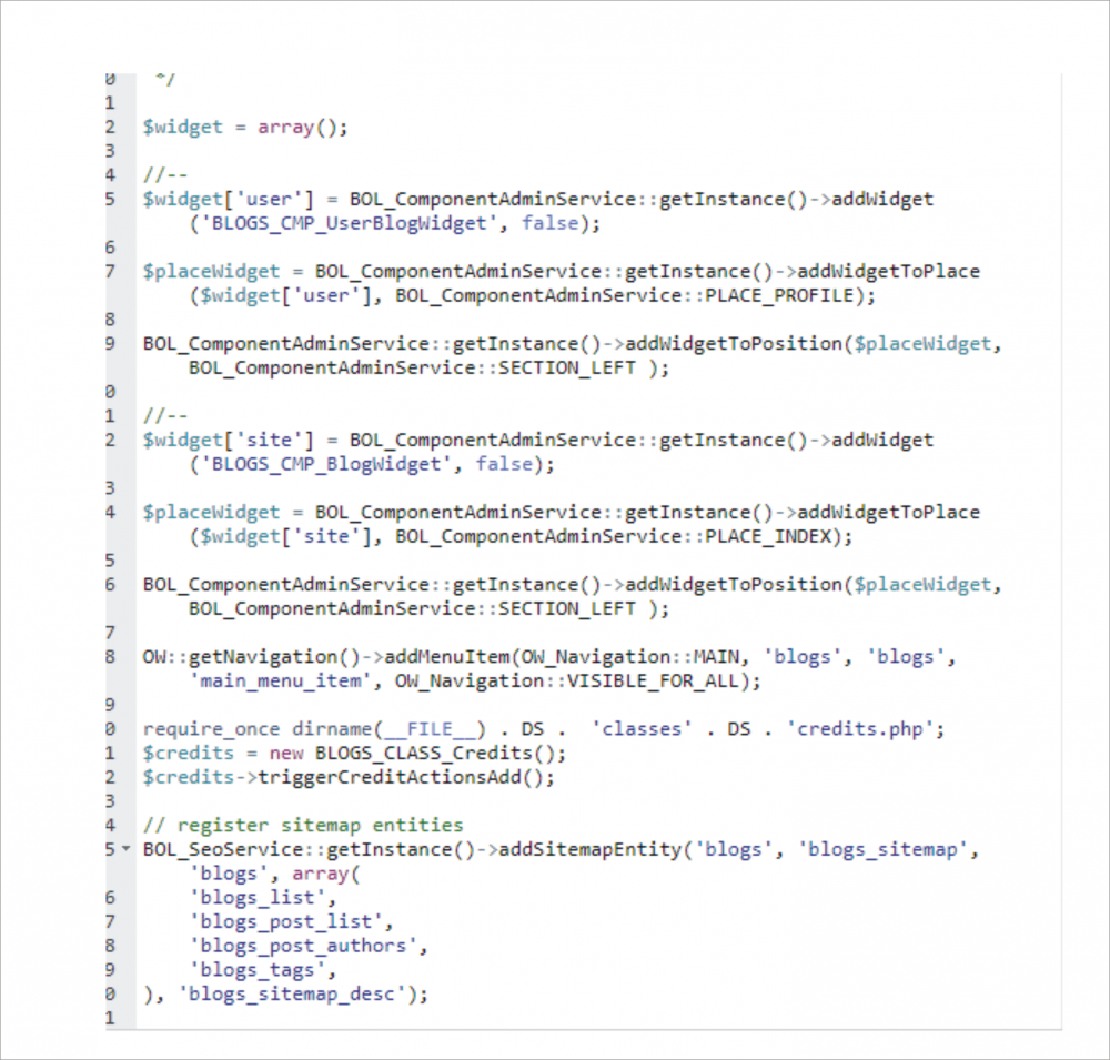
- Goto /ow_plugins
- go to the plugin that use the widget you want remove
- inside the plugin folder Open/Edit activate.php
- Search for PLACE_INDEX or PLACE_MOBILE or something like that
here is a code example:
$placeWidget = $widgetService->addWidgetToPlace($widget, BOL_MobileWidgetService::PLACE_MOBILE_INDEX);
uncomment or delete the line that place the widget in mobile version should working
not forget inactivate and then activate the plugin after changes
Be careful with commenting out or deleting activation lines of code, just modifying the code will cause an error as the item is still in the database record. If you are going to do it that way (not recommended) then be sure to remove the db record(s) as well so that next time you activate the plugin you dont get a DB error.
There are two different classes for pages, one for the desktop and one for mobile. The desktop is CTRL and the mobile is MCTRL
If you are speaking of a 3rd party plugin then youll have to either contact the developer and if that is not possible then i believe you can remove the mobile menu item in admin/mobile settings.
So you want to hide the plugin widget but not the plugin menu item, is that correct? What plugin are you referring to?
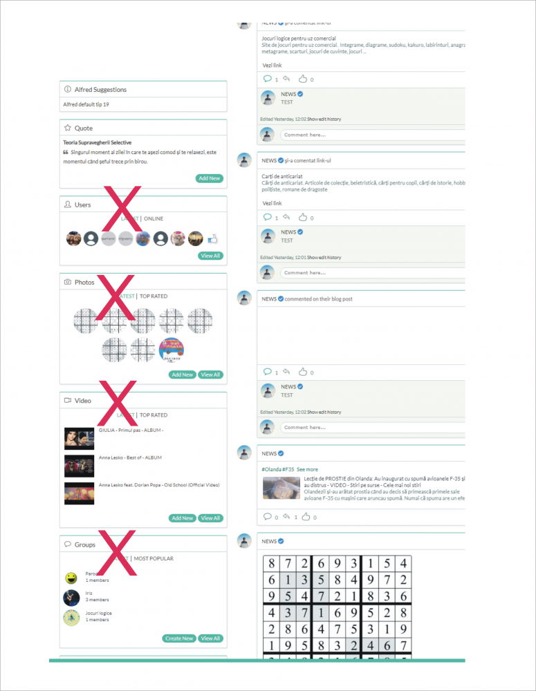
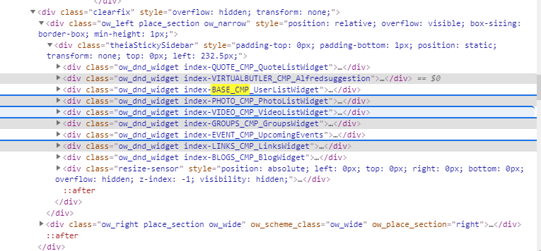
In attach , codes widgets ... but how can hide widgets for mobile ? i write in customize css, but hide on desktop and mobile ... I need hide widgets only on mobile
sorry for my english.
PLACE_MOBILE_INDEX is means the widget are placed on mobile index for example.
Did you remove another line? or only this line?
Maybe i not sure what you goal is?
Leader
see here
https://stackoverflow.com/questions/6370690/media-queries-how-to-target-desktop-tablet-and-mobile
Leader
LeaderGlad you was solve it :)I agree but it depends how you use px, % percent should be used as the standard, but in some cases like this filter px can be used without negative effects because it is a static filter value.
i think some css elements should not bee in px and i not sure why oxwall insist use it. it is not mobile friendly.
but that is another story...
A new question:
How can i hide widgets for desktop version ? I need for hide widgets only on desktop and tablet.
Leader
isDesktop() and isMobile()
use them like this example in php
if(isDesktop())
{
//do something
}
if(isMobile()){
// do something
}
or
if(isDesktop())
{
//do something
}else{
//has to be mobile so do something for mobile
}// close else
I removed the ternary example as it would not work as well.
